Archive

How to plant avocados

Avocados are known to be finicky about their growing conditions. Yes sun but they get sunburnt. Yes water but not too much too often but also don’t let them dry out too much. Varietals that do well in the southern california coast regions often struggle 20 miles inland… etc etc.

I found 2 amazing sources for key information on avocado success, Ellen Baker and Freddie Munge, of https://www.epicenteravocados.com/ have an excellent description of how to get great avocados in the San Francisco Bay Area and NorCal in general, as well as sell great and some obscure varietals. And, Greg Alder of the Yard Posts, which very sadly is at the moment held hostage by cyber criminals, hopefully Greg gets Yard Posts up again soon.

So, once you have a varietal that does well in your climate / microclimate, you need to get it in the ground. Avos don’t do well in containers (Greg Alder has some tips to get them to not die in containers but you wont get much fruit that way). And Avocado trees had sopping wet feet, they need lots of drainage to prevent root rot (Phytophora spp).

They need to be planted on a mound made of sandy soil. Here’s pictures of the process:

Start by clearing the area, I lay down coffee bean bags that I get free from a local roaster to keep weeds/poison oak from taking advantage of the water and fertilizer soon to be soaking down

Now pile the soil, amended with gravel and sand, 35% sand/gravel is good, you may need more for heavy clay. It needs to feel nice and light and flow, and not claggy or thick. Pick out any root bits or other organics, the cados don’t like that stuff.

This is a Lamb Hass from Epicenter Avocados, it’s gotten a bit lopsided from a viscous deer attack last year.

Make sure the mound will extend above the soil level of the potted tree, then take the tree out of the pot (for smaller pots) or slide the pot in and slice it open with an razor blade (try to not hit the avo roots) and pull the pot pieces out. DO NOT BREAK APART THE ROOT BALL!!!! Avocados hate things bothering their roots.

Pile the mound up against the root ball, and have a stake in case you need to tie it in a big wind event, young avocados will break in half in strong winds. You can see my supervisor checking my work above.

Now cover the mound with woodchips, at least 3 inches up to 6″, leaving inches of space between the trunk and the woodchips, you dont want any wood decomposing microbes or fungi to have easy access to the trunk, they rot it. Hardwood chips are best but I often use redwood chips because I have sooooo much and the Cados don’t seem to mind. BUT don’t mix any woodchips or organic material of any kind into the mound soil, Ellen and Freddy and Greg all say it makes the avo roots freak out and maybe die? I’ll take their word for it, they are ultra experts.

Finally, whitewash all the branches with 50/50 latex paint/water

Done! Your avocado will thrive in this mound. Water often and lightly, avocados are unlike citrus and prefer somewhat even water, not soaked and not dried to a crisp. Full sun is good, mine are in 5-7 hrs of sun a day but they are getting nice afternoon sun and they seem happy.

Now just wait 5 years till the first harvest 😀

dynamic plotting with python’s plotly, then deployment to the internet using Heroku

dashHello everyone!

(please note, this post is a work in progress, and for some reason sometimes the heroku web app is not working. Today, 12/12/18 its working but yesterday it wasn’t, I’m unsure what caused this)

Ever wanted to make graphs a little more interactive? I made these nice looking figures using python recently (https://rafaels-rfm-dashboard.herokuapp.com/). The plotly library is great for making interactive graphs. And, if you want to put them on the internet for easy access, plotly has Dash. Dash is a python framework for making crisp visualizations work on the internet. It’s built on Flask, (also plotly.js +react) and best of all for you unrepentant pythonistas, you don’t even need to know a drop of HTML to get it running.

This post assumes basic python knowledge, as well as understanding of basic RFM customer segmentation. However, you don’t need to know what RFM means to get a lot from this post. I just use the terms without defining them, This post is PLENTY long without going into why or why not RFM and churn are important business metrics.

In the next few paragraphs I’ll walk you through the construction of the plots shown in the gif on the left with python, and deployment on the internet for easy sharing, using use_plotly-dashHeroku. Then I’ll talk a bit about things I would like to improve about my implementation.

All the data and code that made this is up on my github page

First, a quick description of the data, its a set of online retail transactions thats made the rounds for a couple years. It’s been on the UC Irvine machine learning repository, and maybe a year ago kaggle put it up as well. So, finding something new about it would be challenging. But, E-commerce data is usually proprietary, so this data set is not totally worthless. And, it wont require much work to put into plot-able form. I’ll describe some other data sets in later posts and we can look at dealing with real world, dirty data then.

First thing to do is clean the data, get rid of duplicates, errors, and other problematic parts. But see above, it’s actually pretty dang clean to begin with so this step is only important if you are using another data set or need to filter out useless/bad information. Sometimes it can be challenging to get the raw data ready for pandas, but this dataset is almost ready to go, just a couple quick passes to process it. I defined some functions to to do this, and they comprise the first block of code here. Please note, wordpress keeps corrupting the following code, so if it looks wrong, or is missing, please refer to my github page linked above, its all there and working. As of today wordpress seems unhappy for some reason with the import section, so you will have to check my github page if for some reason you need to know which packages I used.

Go ahead and click “expand source” to view the code snippets…

# now to define function to return monthly revenue
def monthly_revenue(arr):
revenue = arr['TotalPrice'].sum()
return revenue

def count_monthly_churn(arr):
return arr['churned'].sum()

def clean_and_preprocess(arr):
# time to start cleaning the data
data = arr.dropna()
# remove returned items
data = data[data['Quantity']>0]
#make column for price total of item cost*Quantity
data['TotalPrice'] = data['UnitPrice'] * data['Quantity']
#make datetime from other datatype
data['InvoiceDate'] = pd.to_datetime(data['InvoiceDate'])
return data
def make_RFM_churn_df(arr):
#need the final datetime to calculate recency
final_date_time = arr['InvoiceDate'].max()
#make dataframe with some lambda statements about recency and money spent
RFM_table = arr.groupby('CustomerID').agg({'InvoiceDate' : lambda x: (final_date_time - x.max()).days, 'InvoiceNo' : lambda x: len(x), 'TotalPrice' : lambda x: x.sum()})
RFM_table['customer_ID'] = arr['CustomerID'].unique()
RFM_table['InvoiceDate_int'] = RFM_table['InvoiceDate'].astype(int)
RFM_table.rename(columns = {'InvoiceDate_int' : 'recency', 'InvoiceNo' : 'frequency', 'TotalPrice' : 'monetary_value'}, inplace=True)
RFM_table['churned'] = RFM_table['recency'].apply(is_churned)
return RFM_table

Ok, we have the cleaning and processing functions defined. Now we feed in the csv file, turn it into a pandas dataframe (DF or df), and use the functions to output a new dataframe. The new DF is cleaner, and has new columns, recency and frequency per customer, and one with purchase amount in addition to column for number of items and cost per item. This DF will be used to generate the RFM numbers, but it needs to be hacked apart and pieced together into an ugly list before it will work in a graph with monthly updates to Revenue and Churn numbers controlled by a slider bar (more on how and why later.) We also pickle the dataframe (that means writing it to disk.) Why? Although it saves time if we want reopen the project, more importantly we don’t want to make the function do all the processing when its up on heroku. So, we just make the .pkl files and upload them with the code.


# read the csv data and define datatypes to make it faster
data_raw = pd.read_csv("data.csv", encoding="ISO-8859-1", dtype={'CustomerID': str, 'InvoiceNo': str})
# clean the data with clean_and_preprocess funtion
data_cleaned = clean_and_preprocess(data_raw)

# make the datafarme for the RFM plot then pickle it for ease of modifying plot parameters
data_for_plotly = make_RFM_churn_df(data_cleaned)
data_for_plotly.to_pickle('data_for_plotly.pkl')

Now for a couple steps that might seem a little odd, and I admit it seems hacky. But it works, which ultimately is better than a mostly working but perfectly written script. Basically, we need numbers and month names for the updating data with a slider in plotly. So, we make a list containing monthly slices of the main dataframe using pandas “Grouper” along with groupby in a list comprehension. Note: you need InvoiceDate to be in datetime format for this to work. We also make a list of the months by name for 0-12 (Jan to Jan) and a list of the 13 integers 0-12 for zipping things together later. We also do a bad bad thing and define some empty lists outside of a function. This blatant (and willful) style violation is to make sure jupyter doesn’t feed in non-empty lists to later processes. The later processes don’t actually need the lists to run, I used actual error handling (try and except blocks). But if you don’t empty the list when re-running an ipython kernel the data gets piled in and things go haywire. There could be other fixes for this but I haven’t yet gotten around to trying to implement anything else.


# make a list of all the months in the data
list_RFM_months = [g for n, g in data_cleaned.groupby(pd.Grouper(key = 'InvoiceDate', freq = 'M'))]

# we need the names of the months as well for the plot.ly plots
list_of_month_names = ['Jan', 'Feb', 'Mar', 'Apr', 'May', 'Jun', 'Jul', 'Aug', 'Sep', 'Oct', 'Nov', 'Dec', 'Jan']
# we'll also need a list of the numbers to zip stuff together later
list_1_to_13 = [ i for i in range(13)]

# we need lists and a dataframe to put a bunch of the data into for making sequential time points. This is
# unnecessary (and also bad and wrong) with the try statements EXCEPT when you run the code repeatedly in a jupyter notebook
# you will get problems with the lists already existing,
# and data doesnt end up organized correctly so we make sure they are empty here
monthly_churn_list = []
monthly_revenue_list = []
massive_revenue_churn_list = []
full_data_frame = pd.DataFrame()

Ok, we have a list with 13 dataframes with monthly data now, and RFM data in a separate DF. We need to extract the monthly revenue and churn data (more on why the way I did this is a not perfect way to calculate churn at the end of the post 🙂  )

We take the list of the DFs sliced by month, and loop over it and apply the count monthly revenue and monthly churn functions… But wait, the list has monthly slices, how to calculate churn without reading data from the last month?

I append the monthly DF to a DF containing all monthly DF’s read so far, then calculate total churn, then subtract total churn from the month before to get churn in that month. Yes it’s ugly, but I didn’t get around to making a better way to calculate churn. If this was production code, I would certainly have spent a lot more time making sure this was done right. But this was more just to crank out some numbers for nice looking graphs and a blog post about plotly, not actionable insight for a business.

Note: the now monthly DF only has revenue and churn, and I zip these together with month name, so its not a DF of ALLLLLL the data, just the aggregate results.

Next, we append the sum-to-date dataframe to (what quickly becomes) a big list of dataframes, [df(Jan),] then [df(Jan), “df(Jan+Feb)] then a list with [df[(Jan), df(Jan&Feb), df(Jan&Feb&Mar)] etc. But wait again! Why make a list with increasingly large dataframes if we already have a year-to-date DF? It turns the slider bar is used to select data, and if you have 1 months worth selected then only a single bar is displayed. Thus an oddly structured list with each member consisting of the previous member with a new month appended.  I didn’t use a recursive call to do make the list, but I certainly could have.

Then we zip together (yes another zip) the month numbers to the values of the big list of appended DFs. And in the final data packaging stage, we pickle everything.


for month_data_frame in list_RFM_months:
months_revenue = monthly_revenue(month_data_frame)
print('months revenue = {}'.format(months_revenue))
full_data_frame = full_data_frame.append(month_data_frame)
RFM_data_with_current_month = make_RFM_churn_df(full_data_frame)
this_month_total_churn = count_monthly_churn(RFM_data_with_current_month)
try:
this_month_churn = this_month_total_churn - last_month_total_churn
print('this month churn try loop')
except NameError:
this_month_churn = this_month_total_churn
print('this month churn except loop')
print('this month\'s churn = {}'.format(this_month_churn))
try:
last_month_total_churn += this_month_churn
except NameError:
last_month_total_churn = this_month_churn
try:
monthly_churn_list.append(this_month_churn)
except NameError:
monthly_churn_list = [this_month_churn]
try:
monthly_revenue_list.append(months_revenue)
except NameError:
monthly_revenue_list = [months_revenue]
month_churn_human_readable = [ x * -1 for x in monthly_churn_list]
monthly_revenue_churn_dataframe = pd.DataFrame(list(zip(list_of_month_names, monthly_revenue_list, month_churn_human_readable)), columns = ['Month', 'Revenue', 'Churn'])
massive_revenue_churn_list.append(monthly_revenue_churn_dataframe)

massive_revenue_churn_dataframe = pd.DataFrame(list(zip(list_1_to_13, massive_revenue_churn_list)), columns = ['month_index', 'appended_dataframe'])

with open('massive_revenue_churn_list.pkl', 'wb') as f:
pickle.dump(massive_revenue_churn_list, f)

massive_revenue_churn_dataframe.to_pickle('./massive_revenue_churn_dataframe.pkl')

Awesome. Now on to the Dash and plotly stuff. I’m really liking plotly so far, it’s easy, the documentation is (mostly) good, and it means I don’t have to look at R in the rearview mirror longing for its nice plots. Hey, if you are an R person, there’s even plotly for R. But I digress.

In my github repo this is all in one jupyter notebook, but in production code and for anyone using this post as a tutorial, you should prob just stuff the following code into its own separate script. Otherwise you will hammer through every step of the cleaning arranging each time you call the script. Debugging and perfecting would be time consuming. Also, you don’t want to make heroku (or wherever your code gets deployed) to have to recalculate everything all the time. Just read the pickles as below…

First, we import all the python packages we need. Then we define the flask server, app and the secret key, and import the data to make the graphs. For some reason I couldn’t make heroku happy without this secret key block, the Dash and Heroku instructions weren’t working. Cue 4:15 am panic googling. Thanks to jimmybow for the fix.

import pickle
import dash
import dash_core_components as dcc
import dash_html_components as html
import plotly.graph_objs as go
import plotly.plotly as py
import plotly.tools
import numpy as np
import time, warnings
import datetime as dt
import pandas as pd
from plotly.offline import download_plotlyjs, init_notebook_mode, plot, iplot
from flask import Flask
import os
from dash.dependencies import Input, Output

server = Flask(__name__)
server.secret_key = os.environ.get('secret_key', 'secret')
app = dash.Dash(name = __name__, server = server)
app.config.supress_callback_exceptions = True

with open('massive_revenue_churn_list.pkl', 'rb') as f:
massive_revenue_churn_list = pickle.load(f)
massive_revenue_churn_dataframe = pd.read_pickle('./massive_revenue_churn_dataframe.pkl')
data_for_plotly = pd.read_pickle('./data_for_plotly.pkl')
massive_revenue_churn_dataframe.head()

We start by defining some color defaults. Note they are in dictionary form, as many plotly inputs are. You can pick colors in a variety of ways, I picked from the 140 named colors because I think its easier to think about while staring at code, but if you prefer RGB that works too. I’m unsure if hex colors work. I played a bit with color combinations, and I thought slate grey background with pale turquoise text popped nicely.

The way I wrote the code gets a little spaghetti-ish now. Why? Mostly because I wanted to get a MVP of this post out this week and I put the plots together separately. It’s not unreadably bad, but def something to be fixed later.

EDIT: I fixed the spaghetti issue, thus the following paragraph no longer applies. Basically, I just moved the blocks that these two variables pointed to, and deleted the variables themselves

layout_RFM = (blerp)

and

data_RFM = (derp)

By that I mean I took the (derp) and (blerp) blocks and moved them down top where the variables layout_RFM and data_RFM got called into the

figure = {

section, right below dcc.Graph in the code block 2 sections below. While I could update the code shown to reflect the changes, I’m worried that wordpress will get angry and truncate it the way it did with the first block. So you can crack open a tomato sauce jar and pour it all over this spaghetti code. Actually, that is a bad idea.

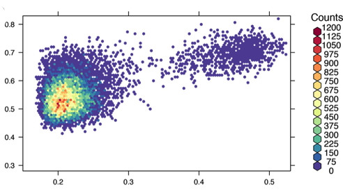
I define a trace, specifically a scatter plot, with plotly.graph_objs, to display each unique customer as a dot, x as recency, y as frequency, and a color scale to show how much moolah they spent over the course of the data set. I used the scale “Picnic” but you could try portland, viridis, blackbody, etc. I also defined the hover text, but the data is a bit dense for this to be an effective thing.
The markers block has all the info for the dots, size, color, outline, and opacity. With dense data like this opaqueness makes it easier to see how dense things actually are, and outlines also help. I used line=0.75 (the line thickness) and line color to be orchid. With size=9 and opacity=0.5 this data seemed easiest to assimilate, but for different data there may be better settings. One could argue that opacity+color scale don’t play well together since it’s hard to see if the darker spots are from overlaid data or different revenue value; and that’s a valid point. But it looks cool and this data isn’t actually important so lets just stick with making it look nicest.

The final block in the following code snippet is just a bit of housekeeping. Labels, typesetting, log scale, etc.

colors = {
'background': 'SlateGray',
'text': 'PaleTurquoise'
}

trace_RFM = go.Scatter(
y = data_for_plotly['frequency'],
x = data_for_plotly['recency'],
text = data_for_plotly['customer_ID'],
hoverinfo = 'text',
mode='markers',
marker=dict(
size=10,

line = dict(
color='LightCoral',
width=1
),
color = data_for_plotly['monetary_value'], #set color equal to a variable
colorbar=dict(
title='Monetary Value',
),
colorscale='Cividis',
showscale=True
)
)
data_RFM = [trace_RFM]

layout_RFM = go.Layout(
title='RFM plot, F vs R (both in a log scale), with M as color, darker color = more customers at that RFM value',
font=dict(family='Courier New, monospace', size=12, color='PaleTurquoise'),
paper_bgcolor='SlateGray',
plot_bgcolor='SlateGray',
xaxis=dict(
title='Recency',
type = 'log',
titlefont=dict(
size=20,
)
),
yaxis=dict(
title='Frequency',
type = 'log',
titlefont=dict(
size=20,
)
)
)

On to the last code snippet… The headline is simple, but then comes the most complex part of the entire script, the slider needs to be defined. More specifically, we need to code what it updates and with what it updates.
First we make the min, the max and the values for the slider bar, then the marks (which for some reason aren’t showing up, another thing to fix).
Then, the app.callback, this is the part of the code that takes reads the slider position, then updates the plot with data. BUT!!! You need to have a function to tell dash what the updated figure looks like. So, remember that month_index zipped into the data frame at the beginning? And the thing getting sliced on the slider I mentioned a few sentences above? These are connected. Basically, the slider selection outputs a string, which then is used to pull a certain slice from the appended_dataframe. This slice has the revenue and churn data from that and all previous months, so if you select the middle you get the data from Jan, Feb, March, April, May and June, but not July, etc. Ok!

Next, the layout of the two updated plots (domain=[0, 0.5] is placing the subplot’s axis between those points), followed by the if __name__ == ‘__main__’ to call the script. If you get errors put port=0 that often fixes ‘port in use’ messages. If that fails, try restarting your jupyter kernel, or picking a port like port=8050 or port=8010

app.layout = html.Div(
style={'fontFamily': 'Courier New, monospace', 'backgroundColor': colors['background']}, children = [
html.H1(
children="Rafael's dashboard,",
style={'textAlign': 'center',
'color': colors['text'],
'fontSize': 32,
'fontFamily': 'Courier New, monospace',
}
),
html.Div(children="use the slider under the first bars to advance the month to show churn and revenue over the course of a year. Note, the axes will align after month 2",
style={'textAlign': 'center',
'color': colors['text'],
'fontSize': 28
}
),

dcc.Graph(id = 'Revenue and Churn with slider'),
dcc.Slider(
id = 'month slider',
min = massive_revenue_churn_dataframe['month_index'].min(),
max = massive_revenue_churn_dataframe['month_index'].max(),
value = massive_revenue_churn_dataframe['month_index'].min(),
marks={str(i): str(i) for i in massive_revenue_churn_dataframe['month_index'].unique()},
),
dcc.Graph(
id = 'RFM',
figure = {
'data': [trace_RFM],
'layout': layout_RFM
})
])

@app.callback(
dash.dependencies.Output('Revenue and Churn with slider', 'figure'),
[dash.dependencies.Input('month slider', 'value')])

def update_figure(selected_index):
appended_dataframe = massive_revenue_churn_list[selected_index]
trace_month_revenue = go.Bar(
x = appended_dataframe['Month'],
y = appended_dataframe['Revenue']
)

trace_month_churn = go.Bar(
x = appended_dataframe['Month'],
y = appended_dataframe['Churn'],
xaxis = 'x2',
yaxis = 'y2'
)
traces = [trace_month_revenue, trace_month_churn]
return {
'data': traces,
'layout': go.Layout(
font=dict(family='Courier New, monospace', size=14, color='PaleTurquoise'),
paper_bgcolor='SlateGray',
plot_bgcolor='SlateGray',
xaxis = dict(
title = 'Monthly Revenue',
domain = [0, 0.45]
),

yaxis = dict(
domain = [0.2, 1]
),

xaxis2 = dict(
title = 'Churn',
domain = [0.55, 1]
),
yaxis2 = dict(
domain = [0, 1],
anchor = 'x2'
)
)
}

if __name__ == '__main__':
app.run_server(port=0)

Weee! The plots are made, all that remains is deployment to Heroku. The following assumes you have a Heroku account, and git. You also need the python packages gunicorn, pip and virtualenv (virtual environment). If you don’t have anaconda, now is the time to get it going to install these.

Fire up ye old terminal emulator, and go to your git directory. The make a new directory,

$ mkdir you_foo_dir_bar

then enter it

$ cd you_foo_dir_bar

Ok, now fire up the virtual environment. It’s a new environment so you need to reinstall whatever python dependencies you need, ie
$ pip install dash
$ pip install dash-renderer
$ pip install dash-core-components
$ pip install dash-html-components
$ pip install plotly
$ pip install gunicorn

and whatever else you need.

Now make a .gitignore file with the lines:
venv
*.pyc
.DS_Store
.env

Now git wont pay attention to these files. Next we make a Procfile with the line:

web gunicorn run:server

This refers gunicorn to the name of the script, “run” . “server” is defined within the script, and it’s a web server. You also need a requirements.txt file, which you populate by piping pip (ha, accidental allitertation) req’s to the file like so:

$ pip freeze > requirements.txt

These are what heroku installs, and if you are like me pip dumps a lot of extraneous package names into this file. In fact, some of them make poor heroku barf and the whole build goes kaput. They also take forever to install when initializing your heroku folder, so go into this file and delete pretty much all of the things other than dash-core-components dash-html-components dash-dependencies flask gunicorn + whatever_other_packages_your_script_calls

Of course, don’t forget the precious script you hacked together. We refer to it as “run” in the Procfile, make sure the names match correctly. NOTE: there is no .py in the Procfile, but .py is on your actual script name.

Now tell heroku to make a new app, the name need not match your script name.

$ heroku create whatever-you-want-to-name-your-app

Stage and commit the directory contents

$ git add .
$ git commit -m “whatever you want to write here about script”

push to heroku:

$ git push heroku master

AAAAAANNNNNDDDDD the moment of truth, start the app on heroku with:

$ heroku ps:scale web=1

And visit the app with (it’s already going at https://whatever-you-named-your-app.herokuapp.com  )

$ heroku open

Done.


Ok, so what would I improve? (Edit, and what I DID fix)
The thing that irritates me the most is the slider labels. I ran into trouble with the labels underneath the bars on the plot, since each bar is labeled, each slider notch was getting all the months glued on as well. I suspect adding another column with month names would work.

Another visual issue with the bar plots is how plotly autoformats their width, so they get progressively thinner. This annoys me and I may fix it soon.

I also don’t like how I defined the data and plot params above the plot that they appear below of, in the actual dashboard. Fixing this is actually pretty simple, but I haven’t gone and done it yet.

EDIT: It was a simple fix, as I mentioned above, I just moved some code the variables were filled with down to where the variables were called. The code makes more sense and is easier to read now, yay!

I mentioned defining the lists outside of the functions, and while thats a no-no, I left them in just because it serves a purpose when running the code repeatedly in a jupyter notebook. Its easier than killing the kernel every time. I have given no further thought to how to solve this.

The hover data in the RFM plot is not working correctly, when hovering over a datum mark, it picks some customerID but only one per x value, and there are lots of very closely spaced marks, thus making the hover feature useless. This limits the usefulness of the plot for finding who the best customers are. If this was production code fixing this would be pretty high priority as the plot isn’t very useful without it.

The color scale combined with transparency is not great, its hard to see if a color is from the revenue value, or if there are piles of customerID R&F values making the area dark. While technically this makes the plot less useful, it is aesthetically pleasing. In the future, I would apply a different technique to spread the data, or remove the color scale entirely and use 2 or 3 separate plots to display the relationship between R, F and M.

Finally, the way I defined churn was not perfect. A 45 day churn period may be more accurate, and there are certainly better ways to crunch the numbers than I did to get the churn. If this was production code I would not have done the churn the way I did; my way was pretty sloppy, and churn is a vital metric.

These are topics that should, could, and perhaps will be addressed in the future. (edit, and some were!)

Well, thats it for now!

Best

Rafael

About Rafael

Hello and thanks for taking the time to learn a little more about me… Who am I? A creative, passionate scientist. A father. I am also a painter, a rock climber, and a deep thinker. This post is an attempt to highlight some non-technical aspects of myself, such as the reasoning behind my educational and career path. If you are interested in code I have written and related things, take a look at my overview page.  It has links to various other posts.

Well, here goes:

A bird’s eye view of Rafael would show my intellectual approach to life is tempered  by a desire to positively affect the world. I am driven to analyze the world (there’s the deep thinking), yet also to experience it and to make it a better place (passion). These aspects of my self drive my career and my hobbies. The differences between them also give rise to my deepest weakness: I am constantly having to choose what to focus on from among the many things I love. I must constantly expend energy to stay on track to achieve big things in a specific field rather than superficial milestones in many areas.

Climbing:

IMG_20170304_163216
another goal: not falling off here again

Ten years ago I went to Yosemite for my first time as a climber. From an overlook on the road I saw an imposing 800 foot pillar of grey and orange granite. When I expressed my interest in climbing it, my climbing partner informed me “That’s the Rostrum. It’s a really serious climb, man.”  The Rostrum immediately become my goal, an unsurprising event given my propensity to fixate on interesting yet challenging things and ideas. In the ten years since I have not let go of that dream and today I am closer than I’ve ever been. I’ve been training specifically for the Rostrum for over two years now. Having a big goal helps me do that extra pushup, or make it do the climbing gym even when I’m feeling tired.

IMG_20170528_121641
El Capitan makes an impressive backdrop to the East Buttress of Middle Cathedral

I also enjoy leading group climbing expeditions, especially when I can impart a bit of my joy for climbing to a newbie. Of course, this comes with a huge responsibility to teach safety on the rock, and awareness of the impact of climbing on the environment and on the experience of non-climbers.

Leading groups entails much more than teaching. Good communication between team members is vital. Everyone needs to be tuned in to whats going on in the group to prevent dangerous mistakes. Furthermore, on long mountain climbs it is often up to the more experienced climbers to make potentially life saving decisions, such as whether to turn around before weather gets bad. Making the choice to retreat without summiting a mountain is very difficult. But, what good is the glory of being on top of the mountain if you don’t make it down with all of your fingers and toes. When decisions are made, sometimes other team members need to be convinced, which often requires yet more positive persuasion techniques. Managing risk, even when not on an alpine peak, is a vital part of being on a climbing team, as is effective listening skills, both for leaders and team members.

While I could easily fill many more paragraphs with thoughts on climbing, I’ll switch the topic now to…

Science:

My scientific journey began in the forest of Northern California while foraging for mushrooms. I became fascinated with how fungi could be used to help the world. So, I went to community college to learn about fungal systems for bioremediation and biofuels. I bought a couple books about the subjects, and I quickly realized that my mind gravitated toward understanding the chemical mechanisms underlying complex biological behavior. UC Berkeley’s reputation for strong chemistry made transferring to a chemistry major at Cal my goal. I made it into the chemical biology major in the Berkeley College of Chemistry (~19% transfer admittance rate to that major that year). I also kept my focus on fungi, and did my undergraduate research on biofuel in a mycology lab.

IMG_20170218_100003
Banana slug eating a mushroom

After my BS I went to UC Santa Cruz for a chemistry PhD. I took a variety of grad level classes: materials chemistry; quantum mechanicsstatistical mechanics; and bio-organic chemistry to name a few. I ended up splitting the difference, and gluing together all the science words. Thus, my diploma has biophysical chemistry written on it. (Not by my kid in crayon haha but maybe she should scrawl some more terms just for fun).

My first projects in grad school involved building and using spectroscopic devices. I’ve built instrumentation (see next picture) from components, including nanosecond time resolved UV-visible devices to measure protein dynamics. I ended up showing that UV-vis and infrared spectra weren’t sufficient to disprove the existence of a radical (unpaired electron) intermediate within a protein. This led me to learn computational chemistry where I modeled the structure and dynamics of proteins, and put to rest a few bad hypotheses.

Bogolmoni_lab_7-20-15-9841
* Here’s a complex spectroscopic device I helped build. It combines a GC, gas tanks, Xenon arc lamp, wavelength selector,  photomultiplier tube and oscilloscope. We used it to measure hydrogen production of a photosynthetic bacteria

Like I do with everything that captures my attention, I went all in and taught myself how to use a variety of computer tools. In addition to the computational chemistry programs I learned Python, R, and shell scripting, all outside of the classroom.

Unsurprisingly, I combined spectroscopic data with computational chemistry in my dissertation, “Examination of the hydrophobicity of the LOV (Light-Oxygen-Voltage) protein active site, using computational chemistry and Raman spectroscopy.” I named it that because what dissertation is worth writing if it’s title doesn’t take up at least a full line of words.

Toward the end of grad school I began doing analytical chemistry and business development for a startup. I really liked the creativity and freedom the position entailed, and I met some very interesting people through the company.

Since then, I’ve been a visiting scholar at UC Santa Cruz, helping a new grad learn molecular biology and working on finishing a paper based on some of my grad school work. I’ve also worked on several data science project with a mentor.

And, starting in 2019 I have been in a leadership role at 2 different manufacturing startups working on a variety of analytical chem, QA/QC, process optimization,  materials characterization and other projects.

So, what would be my ideal job? I’m interested in work environments that foster creativity and open communication. I do well with ambiguity, and I love working with other people. For many reasons I do my best work in collaborative efforts. For example, I think feedback is a great way to improve my ideas, so in grad school I often would recruit the other students (both PhD and undergrads) to talk through my plans. Having other people around who gave candid opinions enabled me to successfully confront my biggest weakness, working on too many projects.

I hope to find work environments where I can grow as a person as well as technically. Continuing to work on my weakest points is important, as is developing my strong suits, creativity and analytical thinking.  I love coding, chemistry and protein biophysics. The exact project that I am working on is not very important to me, since there are so many things that I can get very interested in. Rather, it is the work environment, team, and positive impact that are the primary things I look for in a job.

Conclusion:

Humans are complex creatures, and I am no exception. There are many other facets I would be happy to share in a conversation.

I’ll close this post with a quote from one of my favorite authors. In Swann’s Way, Marcel Proust describes his thoughts solidifying after waking up in a strange room…

“Perhaps the immobility of the things that surround us is forced upon them by our conviction that they are themselves, and not anything else, and by the immobility of our conceptions of them.  “

42595340_2204040159836287_6447683876318871552_n

Recursive python code to analyze ways to cut a rope into ever smaller pieces

cut_rope
generated by myself, in Adobe Illustrator

In a recent coding challenge one question was to get some statistics on the length of rope left after a certain number of cuts. Starting with rope length N, the rope is cut into 3 random but integer length pieces; if this is impossible no more cuts are made. The largest piece resulting is then subject to 2 more cuts. Repeat this T times. The last remaining longest piece is recorded. The statistical questions were on the conditional probability of a certain length if at least at a certain other length.

This post is about the code I wrote for this challenge, and what I would improve if I were to rewrite it.

I implemented a recursive algorithm to generate lots of data and put it into a list. Then I imported the list as a pandas data frame for the statistical analysis. Here is the core function (with debugging print statements removed):

def cut(N, T):
	bit = N
	T_counter = T
	if T_counter >= 0:
		x = random.randrange(1, N-1)
		y = random.randrange(x, N)
		peices = [ x, y - x, N -y]
		bit = max(peices)
		T_counter -= 1
		if bit > 3:
			return cut(bit, T_counter)
		else:
			S_list.append(bit)
	else:
		S_list.append(bit)

There are a couple parts that I would change if I were to rewrite without time constraints. If you are a very careful reader, you would notice that the function adds to a list thats not defined within the function… this is sloppy. I should make the function return a list, then call the function as so:

list_to_analyze = cut(N, T)

I had the code save to file a .csv made from the list of end rope lengths, this was only necessary to backup my data if my ancient laptop were to crash. I could have just turned the list into a pandas data frame and saved a few lines.

I didn’t have time to learn how to use bayespy, but that would have made the statistical portion of the code much more readable.

Finally, making the N and T’s user defined, rather than hardcoded would be a nice touch, say with sys argv or even user defined input.

Well, thats it for now, and if you want to see the whole script, it follows.

~Rafael

import matplotlib.pyplot as plt
import pandas as pd
import math
import csv
import math
import random

S_list = []
def cut(N, T):
	bit = N
	T_counter = T
	if T_counter >= 0:
		x = random.randrange(1, N-1)
		#print 'x = {} '.format(x)
		y = random.randrange(x, N)
		#print 'y = {} '.format(y)
		peices = [ x, y - x, N -y]
		bit = max(peices)
		#print 'bit = {} '.format(bit)
		T_counter -= 1
		if bit > 3:
			return cut(bit, T_counter)
		else:
			S_list.append(bit)
			#print 'N too short end. S = {} added to S_list \n'.format(bit)
	else:
		S_list.append(bit)
		#print 'T end. S = {} added to S_list \n'.format(bit)

iter = 100000000
while iter >=0:
	cut(1024, 10)
	iter -= 1

#print 'S_list = {}'.format(S_list)

csvfile = "N1024_T10.csv"
with open(csvfile, "w") as output:
	writer = csv.writer(output, lineterminator='\n')
	for val in S_list:
	        writer.writerow([val])

S_list = []
iter = 100000000
while iter >=0:
	cut(64, 5)
	iter -= 1

#print 'S_list = {}'.format(S_list)

csvfile = "N64_T5.csv"
with open(csvfile, "w") as output:
	writer = csv.writer(output, lineterminator='\n')
	for val in S_list:
	        writer.writerow([val])

# name data colums and read data
name_64 = ['S_64']
name_1024 = ['S_1024']
df_64   = pd.read_csv('N64_T5.csv', names = name_64)
df_1024 = pd.read_csv('N1024_T10.csv', names = name_1024) 

# simple extraction of stats
print df_64.describe()
print '\n'
print df_1024.describe()
print '\n'

# count instances for prob
dens_64_tmp = df_64['S_64'].value_counts(normalize=True)
dens_1024_tmp = df_1024['S_1024'].value_counts(normalize=True)

# filter data for conditional probs
dens_64 = dens_64_tmp.to_frame().reset_index()
dens_1024 = dens_1024_tmp.to_frame().reset_index()
#
dens_64_fil_8 = dens_64['index'] > 8
dens_64_fil_4 = dens_64['index'] > 4

dens_1024_fil_12 = dens_1024['index'] > 12
dens_1024_fil_6  = dens_1024['index'] > 6

dens_64_over_8 = dens_64[ dens_64_fil_8 ]
dens_64_over_4 = dens_64[ dens_64_fil_4 ]

dens_1024_over_12 = dens_1024[ dens_1024_fil_12 ]
dens_1024_over_6 =  dens_1024[ dens_1024_fil_6 ]

# calc probability of everything
dens_64_sum_over_8 = dens_64_over_8['S_64'].sum()
dens_64_sum_over_4 = dens_64_over_4['S_64'].sum()
prob_over_8_if_over_4 = dens_64_sum_over_8 / dens_64_sum_over_4 

dens_1024_sum_over_12 = dens_1024_over_12['S_1024'].sum()
dens_1024_sum_over_6  = dens_1024_over_6[ 'S_1024'].sum()
prob_over_12_if_over_6 = dens_1024_sum_over_12 / dens_1024_sum_over_6 

# print conditional stats
print 'dens_64_sum_over_8 = \n{} \n'.format(dens_64_sum_over_8)
print 'dens_64_sum_over_4 = \n{} \n'.format(dens_64_sum_over_4)
print 'prob_over_8_if_over_4 = {} \n'.format(prob_over_8_if_over_4)

print 'dens_1024_sum_over_12 \n{}\n'.format(dens_1024_sum_over_12)
print 'dens_1024_sum_over_6 \n{} \n'.format(dens_1024_sum_over_6)
print 'prob_over_12_if_over_6 = {} \n'.format(prob_over_12_if_over_6)

Tweet content compared to news headlines

Here are 2 wordclouds I made to illustrate similarities and differences in information on twitter and on news website front pages. I scraped 1 day of headlines from the NYtimes, Fox News, Wall Street Journal, Washington Post, the Raw Story and Breitbart.  I also collected tweets containing the phrase “fake news” for 3 hours. Although I filtered 2,000 tweets, their word diversity was very small compared to just one days worth of headlines on 6 news sites. The news site words are also much longer, and appear more sophisticated. The first image is a venn diagram of the two data sets, and the second is a wordcloud of all the overlapping words, minus some low information words that were crowding more interesting ones.

It is interesting that the overlapping words have a lot of intensity, despite their brevity. For example, bad, right and cartel feature prominently.

I am expanding this project, and expect updates in the future.

twit_news_venn_wordcloud_captioned

wordcloud copy

pretty heatmap of hexagonally binned data

Hello All,

If you have read some of my earlier posts, I focused a lot on the role of water in protein function.  The plots in this post show that water locks an important amino acid into position.

After inserting water into the simulation, then quantifying how much time water spent in the enzyme active site, I examined the dynamics of other amino acids relative to the water location.

First, I used the GROMACS Molecular Dynamics (MD) suite to output distances between water and another atom inside the protein, indexed with time. Then I did the same for a amino acid know to be key in the signal transduction function of this protein. I had to write a python script to extract the relevant data from the MD output, and turn it into .csv format. I plotted these with time as a parameter using the R package hexbinplot, with a color ramp to indicate counts in each bucket. I  polished the plot up with colorbrewer, making it more aesthetically appealing.

(caption below)

hexbins_and_structure

A: Mutant protein, it is locked into one conformation. Why the mutant does this is beyond the scope of this post. But this figure shows that the amino acid is indeed locked into one place.

B: Wild type protein. The low population island in the upper right represents the signaling state, and the main density in the left is the non signaling state.

C: Snapshot of the simulation showing the water pushing the amino acid out into the signaling state. This image is a representation of what the island in B looks like

Water radial distribution function within protein, and potential of mean force calculations

So after I produced MD simulations with a water within a protein, I needed both a quantification of whether the water stayed put, and if so how much time did it spend coordinated to important inner atoms.

The latter is easiest expressed as a Radial Distribution Function (RDF). This function is the radial distance between 2 particles. Although simple, this metric is connected to deep statistical mechanical properties of the system. One property that I was interested in is the free energy of binding of the water. This is the energy is that which is required to pull the bound particle into the bulk surroundings and is named the Potential of Mean Force (PMF).

One can see how the energy binding a particle in place would be correlated with how much time it spends near the thing it is bound to. And  in fact, the PMF free energy is calculateable from the RDF.

-RT ln (RDF) = PMF

Where R is the gas constant, and T is temp. The difference between the high and low point of this curves is the binding energy.

So, I exported the RDF for water about an interior atom the water was observed to locate near.  The output file was readable in the Linux plotting program, but I wanted to work the data more easily, so I had to write a little python script to extract the data, and turn it into a .csv form. This ended up with millions of data points, and both excel and the Linux excel replacement crashed when I tried to open it. I had to turn to R, which easily dispensed with the processing, and figure creation.

Pow.

A: The bound water, coordinated to flavin and two amino acids.

B: density (any oxygen in water, to be exact) VS distance (aka the Radial Distribution). For the wild type and an interesting mutant.

C: PMF versus distance. The difference between high and low is the binding energy. Also for the wild type and the interesting mutant.

ENVOY_for_blog_RDF_PMF

Animations of molecular vibrations

ScentedJoyfulDoctorfish-size_restricted

One of the key parts of my dissertation was about molecular vibrations. Basically, Raman and Infrared spectroscopic data were/was (yes, were is technically correct but it just doesn’t ever sound ‘right’) showing or not showing a certain vibrational band. The researchers who saw the band all the time said one hypothesis was therefore false. Researchers who sometimes did, and sometimes didn’t see the vibrational band claimed that said hypothesis was in fact, not disproven at all. Sounds obtuse? Well, this was academia.

Anyway, I ran a bunch of quantum calculations using the Orca Quantum Chemistry program suite. First, I optimized the geometry using Density Functional Theory, with a normal mode vibration calculation as well. Then  I utilized more of Orca’s program suite to output frames of the vibrations for molecular visualization programs in a .xyz format. I read these files, then animated vibration using the pymol built from source, (since that allows for more plugins) with the MP4 encoder plugin. (see Pymol_instructions ). An easier, but longer way would have been to tell pymol to output single frame images, then use an external program to turn them into an animation.

So, here they are: selected normal modes of the amino acid, Cysteine, in different protonation states.

WigglyDisloyalDarklingbeetle-size_restricted

Python code to add a water molecule in between user defined particles within a MD simulation

(Note: This post is very much a work in progress. I’m going through and rewriting a script with my new python skills I have been learning)

In order to use Molecular Dynamics (MD) simulations to determine the energy of water within a protein, water actually needs to be inside the protein. However, starting coordinates of proteins typically do not contain water.

I wrote some code to take simulation data in text form containing position and momentum in 3 dimensions for all atoms (the .gro file format from the GROMACS MD suite to be precise), ask the user to pick 3 residues and an atom from all 3, then insert water into every frame at the middle point between 3 residues. The pictures in this post were made after utilizing the code to add water to the interior of the protein model. I made the images from simulation frames visualized in UCSF Chimera, then processed with photoshop and illustrator.

water_in_ENVOY

I wrote this script as I was learning python. Since then I’ve learned a lot more. When I reread it before posting here I found some things I would change if I were to write it again today. Here are some snippets I rewrote. The full script is at the bottom of the post.

I took this large and semi-readable block and rewrote it by defining a couple functions, and renaming some variables to be more understandable

ugly_code

The new functions:

defined_function_code

And this made the code much cleaner, and a bit more concise.

better_code.png

It’s still not perfect, as the loops on lines 80 and 75 have a hardcoded number to iterate up to. I haven’t done the math to figure out a function output the right number yet.

Here’s the original code:

# script to create acceptable .gro file for processing into tpic inp trajectory from .gro format trajectory

import sys
import math
import os

# import file and read each line into list
print "importing .gro file"
trj_out = open(sys.argv[2], 'w')
trj_raw = open(sys.argv[1], 'r' )
list_lines = trj_raw.read().splitlines()
trj_raw.close()

# get input from user to pick which amino acids and atoms in the amino acids to put the water between
aa_1_no = raw_input( "which amino acid to take first coordinates from? Please use the form 100ALA, and input amino acids in numerical order, ie amino acid 13 should be imputted before amino acid 14)     ")
aa_1_atom_no = raw_input( "which atom in that amino acid to take coordinate of? (please use caps)     ")

aa_2_no = raw_input( "which amino acid to take second coordinates from? (please use the form 100ALA)    ")
aa_2_atom_no = raw_input( "which atom in that amino acid to take coordinate of? (please use caps)     ")

aa_3_no = raw_input( "which residue to take third coordinates from? (use the form 103ALA)            ")
aa_3_atom_no = raw_input( "which atom in that residue to take coordinates of? (use caps)                ")

# some test atoms and amino acids hard coded
#aa_1_no = '103CYS'dd
#aa_1_atom_no = 'S'
#aa_2_no = '135CYS'
#aa_2_atom_no = 'S'

# some housekeeping to keep the correct format of the input and output files
# must make sure the correct number of particles, and frames is written
old_particle_no = list_lines[1]
new_particle_no = int(old_particle_no) + 1
new_particle_no = repr(new_particle_no)
print new_particle_no
print 'old particle number = {}   , new particle number = {} '.format(old_particle_no, new_particle_no)
no_of_original_lines =  len(list_lines)
no_of_frames = list_lines.count(old_particle_no)
lines_per_frame = no_of_original_lines / no_of_frames
print "number of frames = {} ".format(no_of_frames)
old_last_residue_no = list_lines[ ( no_of_original_lines - 2 ) ].translate(None, 'CLNASOL').split()[0]
new_last_residue_no = int(old_last_residue_no) + 1
print 'original last residue number = {} , new last residue number = {} '.format(old_last_residue_no, new_last_residue_no)

# make generator from the list composed of the lines in the input file
gen = (n for n,y in enumerate(list_lines))
# iterate over generator to make individual strings of each list member (ie each line in the list is now a string)
for n in gen:
	line_contents_a = list_lines[n-1:n]
	line_str_a = ', '.join(map(str, line_contents_a))
	#print 'line number = {}    line contents = {}'.format(n, line_contents)
        #if line_n is '12824' :
        #	print 'this is line_str  {}'.format(line_str)
# change metadata at top of new file to reflect new particle numbers
	if line_str_a  == str(old_particle_no) :
        	print "changing particle number"
		list_lines[n-1] = new_particle_no

# find the lines containing the first of the atoms between which the new water will be inserted
	if line_str_a.startswith( aa_1_no , 2 ) and line_str_a.startswith( aa_1_atom_no , 13 ):
# print the frame number being modified. mostly just for entertainment but the frame number itself is needed later
		for x in  range(1, (no_of_frames + 1 )) :
			#print 'reading the first {} lines '.format(x * lines_per_frame)
			if (x * lines_per_frame) > n :
				current_frame_no = x
				print 'current frame is {} '.format(current_frame_no)
				break
		atom_a_line = line_str_a
		print "atom a line = {} ".format(atom_a_line)
# now time to find the next atom from the next amino acid. I think the amino acids need be inputted in order that they appear for this block to work
		for m in range(1, 1000000):
			line_contents_b = list_lines[ m+n-1 : m+n ]
			line_str_b = ', '.join(map(str, line_contents_b))
			if line_str_b.startswith( aa_2_no , 2 ) and line_str_b.startswith( aa_2_atom_no , 13 ):
				atom_b_line = ', '.join(map(str, list_lines[n+m-1 : m+n]))
				print 'atom b line = {} '.format(atom_b_line)
#now its time to rip the strings apart to get the tasty coordinate data.
				segments_a = atom_a_line.split()
				segments_b = atom_b_line.split()
# since the third amino acid/atom to place the water between as added later I put the code to match the third atom after
# the line.split() call. Possible I defined segements_a and segments_b twice for no good reason
	                        for p in range(1, 1000000):
	                        	line_contents_c = list_lines[ m + n + p - 1 : m + n + p ]
	                        	line_str_c = ', '.join(map(str, line_contents_c))
	                        	if line_str_c.startswith( aa_3_no , 2 ) and line_str_c.startswith( aa_3_atom_no , 13 ):
	                        		atom_c_line = ', '.join(map(str, list_lines[n+m-1 : m+n]))
	                        		print 'atom b line = {} '.format(atom_c_line)
	                        		segments_a = atom_a_line.split()
	                        		segments_b = atom_b_line.split()
						segments_c = atom_c_line.split()

#define current and new xyz coords after extracting the correct slice from the line.split and turning it into float
				a_x = float(segments_a[3])
				a_y = float(segments_a[4])
				a_z = float(segments_a[5])
				b_x = float(segments_b[3])
				b_y = float(segments_b[4])
				b_z = float(segments_b[5])
                                c_x = float(segments_c[3])
                                c_y = float(segments_c[4])
                                c_z = float(segments_c[5])
# math to define point in between the 3 atoms
				newx = round((a_x+b_x)/2, 3)
				newy = round((a_y+b_y)/2, 3)
				newz = round((a_z+b_z)/2, 3)
# new string to be jammed into end of frame.
				new_coord = '{}SOL       {}   {}   {}   {}'.format(new_last_residue_no, new_particle_no, newx, newy, newz )
				print 'new line from average coordinates = {} '.format(new_coord)
# determine where to insert new line based on frame number and lines per frame determined at beginning of script, insert line and break back to the next frame.
				insert_new_coord_at = ( current_frame_no * lines_per_frame )-1
				list_lines.insert(insert_new_coord_at, new_coord)
				break

# add line to close files after reading? no, closed raw input file at beginning of script.
print ' writing output file, " {}  " '.format(sys.argv[2])
trj_out.write('\n'.join(list_lines))
print "complete."
#	if line.startswith('   449ASN'):
   #ASN_line = line
   #VAL_line = line - 533
   #ASN_line.splitA

And the new version:

<span id="mce_SELREST_start" style="overflow:hidden;line-height:0;"></span>
# script to create acceptable .gro file for processing into tpic inp trajectory from .gro format trajectory# script to create acceptable .gro file for processing into tpic inp trajectory from .gro format trajectory
import sysimport mathimport os
def list_slice_2_str(lis, number): line_contents_a = list_lines[number - 1: number] line_str = ', '.join(map(str, line_contents_a)) return line_str
def return_frame_no(number): for x in range(1, (no_of_frames + 1)): if (x * lines_per_frame) &gt; number: current_frame_no = x return current_frame_no
# import file and read each line into listprint "importing .gro file"# trj_out = open(sys.argv[2], 'w')# trj_raw = open(sys.argv[1], 'r' )trj_out = open('test_out.gro', 'w')trj_raw = open('tpic_test.gro', 'r')
list_lines = trj_raw.read().splitlines()trj_raw.close()aa_1_no = '103CYS'aa_1_atom_no = 'S'aa_2_no = '104ASP'aa_2_atom_no = 'C'aa_3_no = '105ILE'aa_3_atom_no = 'C'# get input from user to pick which amino acids and atoms in the amino acids to put the water between# aa_1_no = raw_input( "which amino acid to take first coordinates from? Please use the form 100ALA, and input amino acids in numerical order, ie amino acid 13 should be imputted before amino acid 14)     ")# aa_1_atom_no = raw_input( "which atom in that amino acid to take coordinate of? (please use caps)     ")
# aa_2_no = raw_input( "which amino acid to take second coordinates from? (please use the form 100ALA)    ")# aa_2_atom_no = raw_input( "which atom in that amino acid to take coordinate of? (please use caps)     ")
# aa_3_no = raw_input( "which residue to take third coordinates from? (use the form 103ALA)            ")# aa_3_atom_no = raw_input( "which atom in that residue to take coordinates of? (use caps)                ")
# some housekeeping to keep the correct format of the input and output files # must make sure the correct number of particles, and frames is writtenold_particle_no = list_lines[1]new_particle_no = int(old_particle_no) + 1new_particle_no = repr(new_particle_no)print new_particle_noprint 'old particle number = {}   , new particle number = {} '.format(old_particle_no, new_particle_no)no_of_original_lines = len(list_lines)no_of_frames = list_lines.count(old_particle_no)lines_per_frame = no_of_original_lines / no_of_framesprint "number of frames = {} ".format(no_of_frames)old_last_residue_no = list_lines[(no_of_original_lines - 2)].translate(None, 'CLNASOL').split()[0]new_last_residue_no = int(old_last_residue_no) + 1print 'original last residue number = {} , new last residue number = {} '.format(old_last_residue_no, new_last_residue_no)
# make generator from the list composed of the lines in the input file and indicesgen = (n for n, y in enumerate(list_lines))# iterate over generator to make individual strings of each list member (ie each line in the list is now a string)for iter_1_no in gen: line_str_a = list_slice_2_str(list_lines, iter_1_no) if line_str_a == str(old_particle_no): print "changing particle number" list_lines[iter_1_no - 1] = new_particle_no print 'line_str_a = {} '.format(line_str_a) if line_str_a.startswith(aa_1_no, 2) and line_str_a.startswith(aa_1_atom_no, 13): current_frame_no = return_frame_no(iter_1_no) print 'current frame is {}'.format(str(current_frame_no)) atom_a_line = line_str_a segments_a = atom_a_line.split() print "atom a line = {} ".format(atom_a_line) for iter_2_num in range(1, 1000000): line_str_b = list_slice_2_str(list_lines, iter_1_no + iter_2_num) if line_str_b.startswith(aa_2_no, 2) and line_str_b.startswith(aa_2_atom_no, 13): atom_b_line = line_str_b                segments_b = atom_b_line.split()                for iter_3_no in range(1, 1000000): line_str_c = list_slice_2_str(list_lines, iter_2_num + iter_1_no +  iter_3_no) if line_str_c.startswith(aa_3_no, 2) and line_str_c.startswith(aa_3_atom_no, 13): atom_c_line = line_str_c print 'atom c line = {} '.format(atom_c_line) segments_c = atom_c_line.split() # define current and new xyz coords after extracting the correct slice from the line.split and turning it into float a_x = float(segments_a[3]) a_y = float(segments_a[4]) a_z = float(segments_a[5]) b_x = float(segments_b[3]) b_y = float(segments_b[4]) b_z = float(segments_b[5]) c_x = float(segments_c[3]) c_y = float(segments_c[4]) c_z = float(segments_c[5]) # math to define point in between the 3 atoms newx = round((a_x + b_x) / 2, 3) newy = round((a_y + b_y) / 2, 3) newz = round((a_z + b_z) / 2, 3) # new string to be jammed into end of frame. new_coord = '{}SOL       {}   {}   {}   {}'.format(new_last_residue_no, new_particle_no, newx, newy, newz) print 'new line from average coordinates = {} '.format(new_coord) # determine where to insert new line based on frame number and lines per frame determined at beginning of script, insert line and break back to the next frame. insert_new_coord_at = (current_frame_no * lines_per_frame) - 1 list_lines.insert(insert_new_coord_at, new_coord) break
# add line to close files after reading? no, closed raw input file at beginning of script.#print ' writing output file, " {}  " '.format(sys.argv[2])trj_out.write('\n'.join(list_lines))print "complete."# if line.startswith('   449ASN'):# ASN_line = line# VAL_line = line - 533# ASN_line.splitA

End! Thanks for reading

Here is a selection of some of my computational work. Code, animations and such

During my PhD I used a lot of computational tools, and worked with a lot of data. This blog displays a selection of what I used. The main things I used were python, R (shiny and ggplot), Zsh shell scripts, and computational chemistry modeling programs (Orca for quantum and GROMACS for classical simulations). I’d be happy to answer any questions people have about how/why I did stuff.

For my post with a python script, where I pick apart an old script: Python code to add a water molecule

For my post with a nice looking arrangement of 2 variables linked with a parameter: pretty heatmap of hexagonally binned data

For some gifs of molecular vibrations from quantum calculations that I ran: Animations of molecular vibrations

If what you want is ramblings about odd/interesting biological (mostly) topics then check out my other blog rafabiocali


Tag cloud: